protego partners ltd
Protego Partners Ltd is a start-up business that offers independent strategic expertise to efficiently manage financial governance and planning goals for high net-worth families.
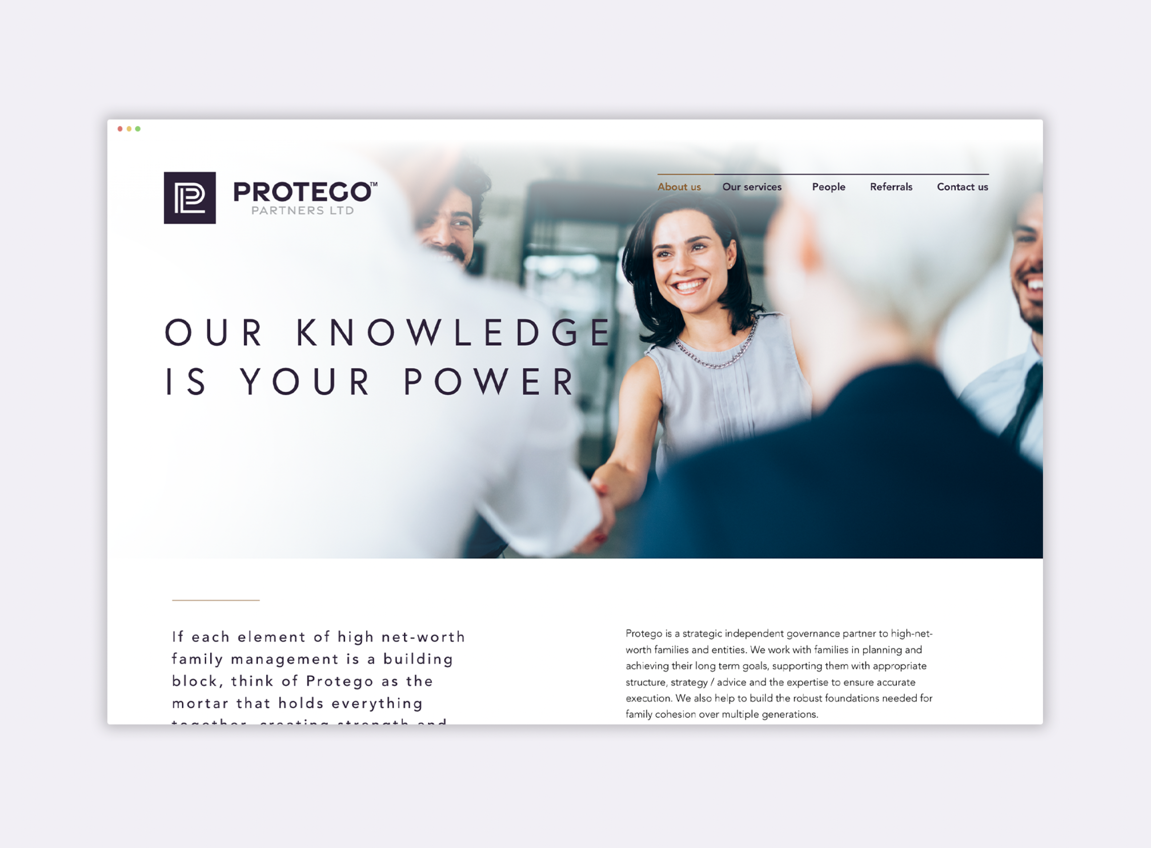
The goal on this job was to create a logo, website and business cards that showcase the brand’s sharp, experienced and trustworthy personality.
The logo icon uses the three starting letters of the brand ‘PPL’ to create a symbol that encapsulates the brand and can also stand on its own. The typeface is a strong, sharp-edged sans serif reflecting the backbones of the business.
The mix of soft and deep purples, white and a touch of gold creates a feeling of richness, prestige and knowledge. These purple tones are also used within the imagery of smiling, contented clients. The brand has a bright, fresh and modern presence designed to draw in the kind of clients this business is targeting.