cubadupa re-brand
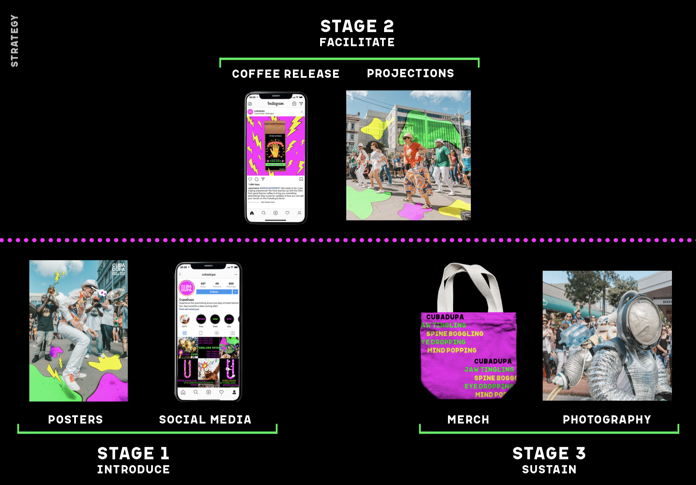
This was a project at Massey University. Our objective was to give the street festival ‘CubaDupa’ a fresh re-brand that would encompass everything that makes it a unique highlight of the Wellington social calendar.
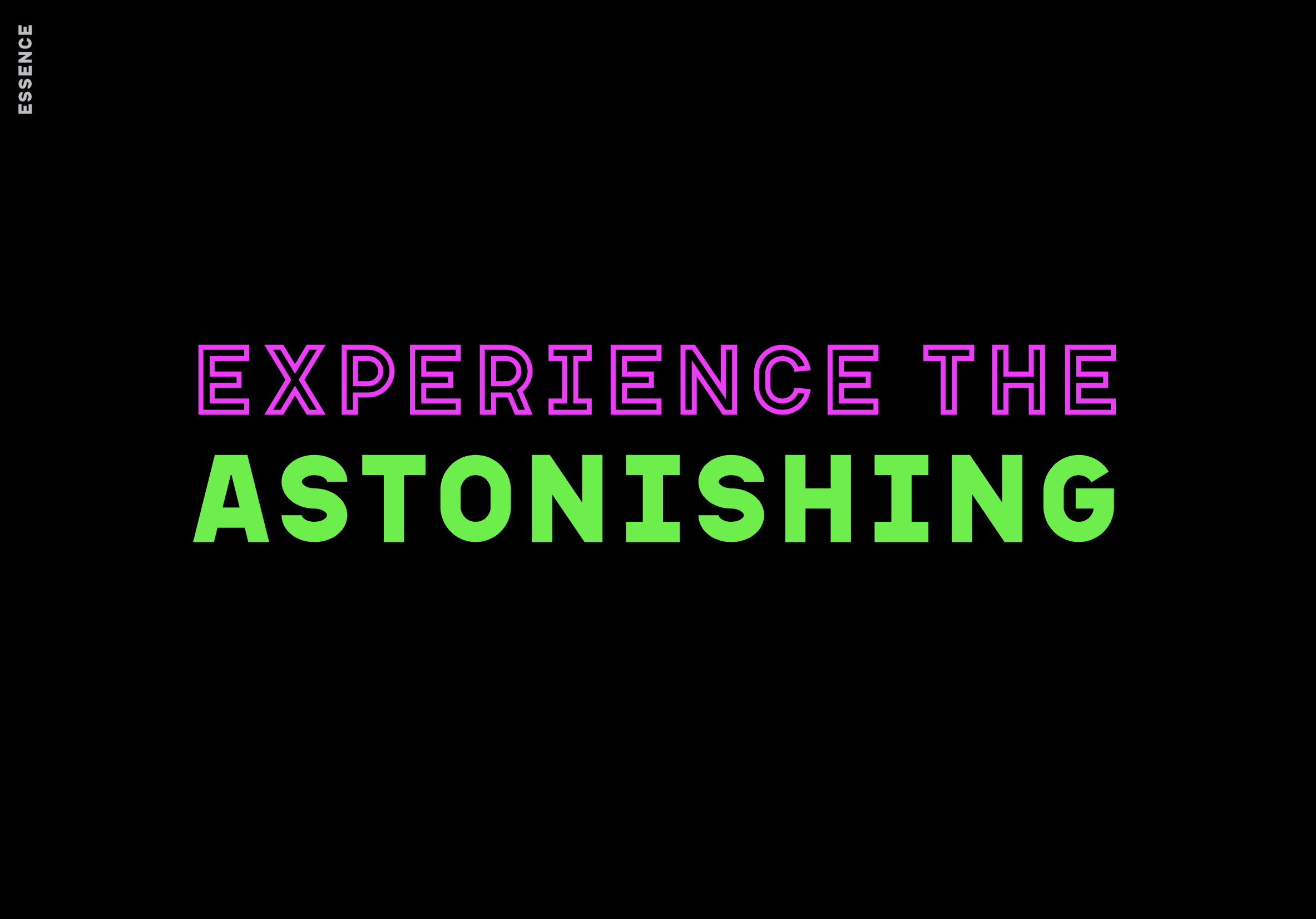
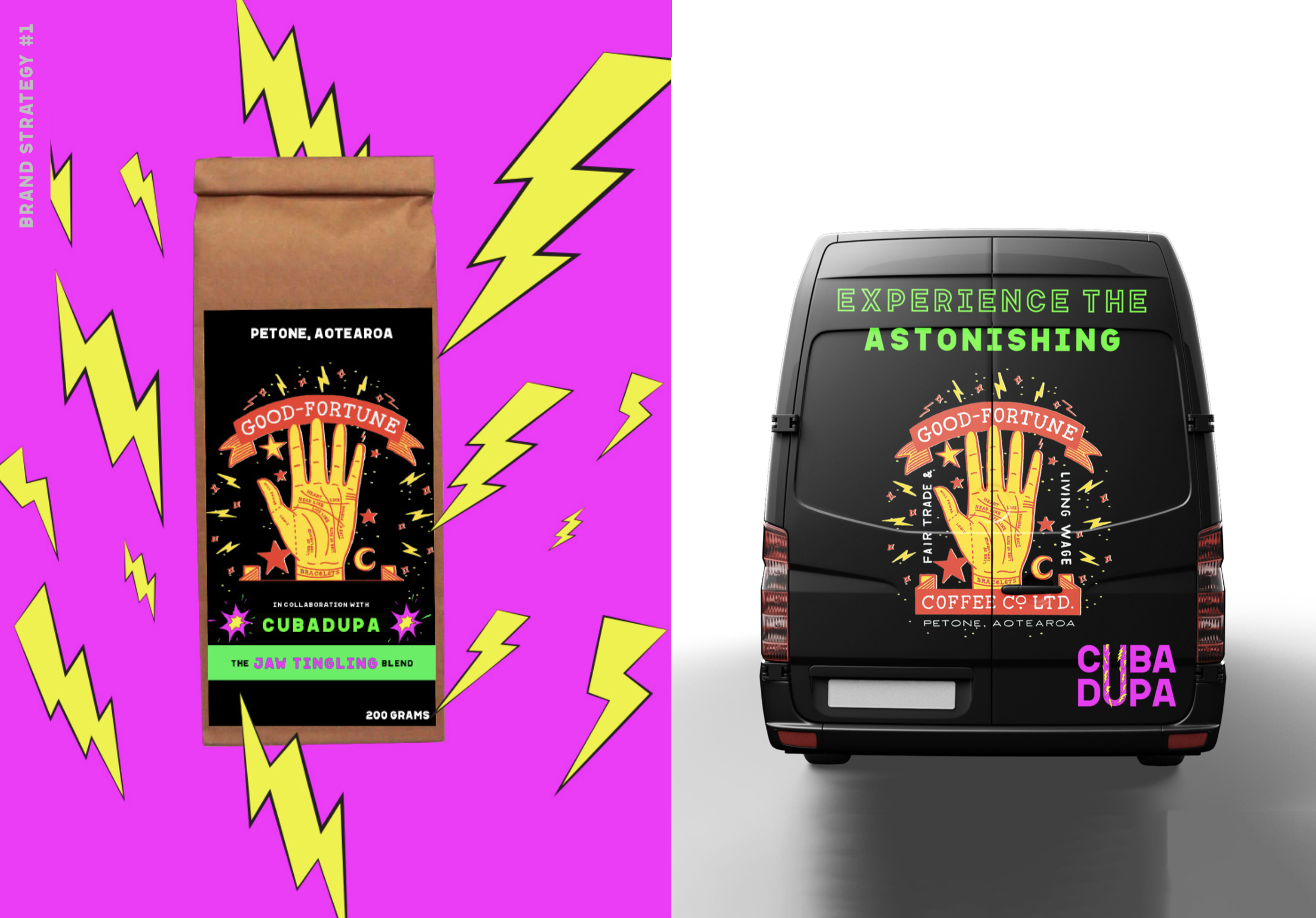
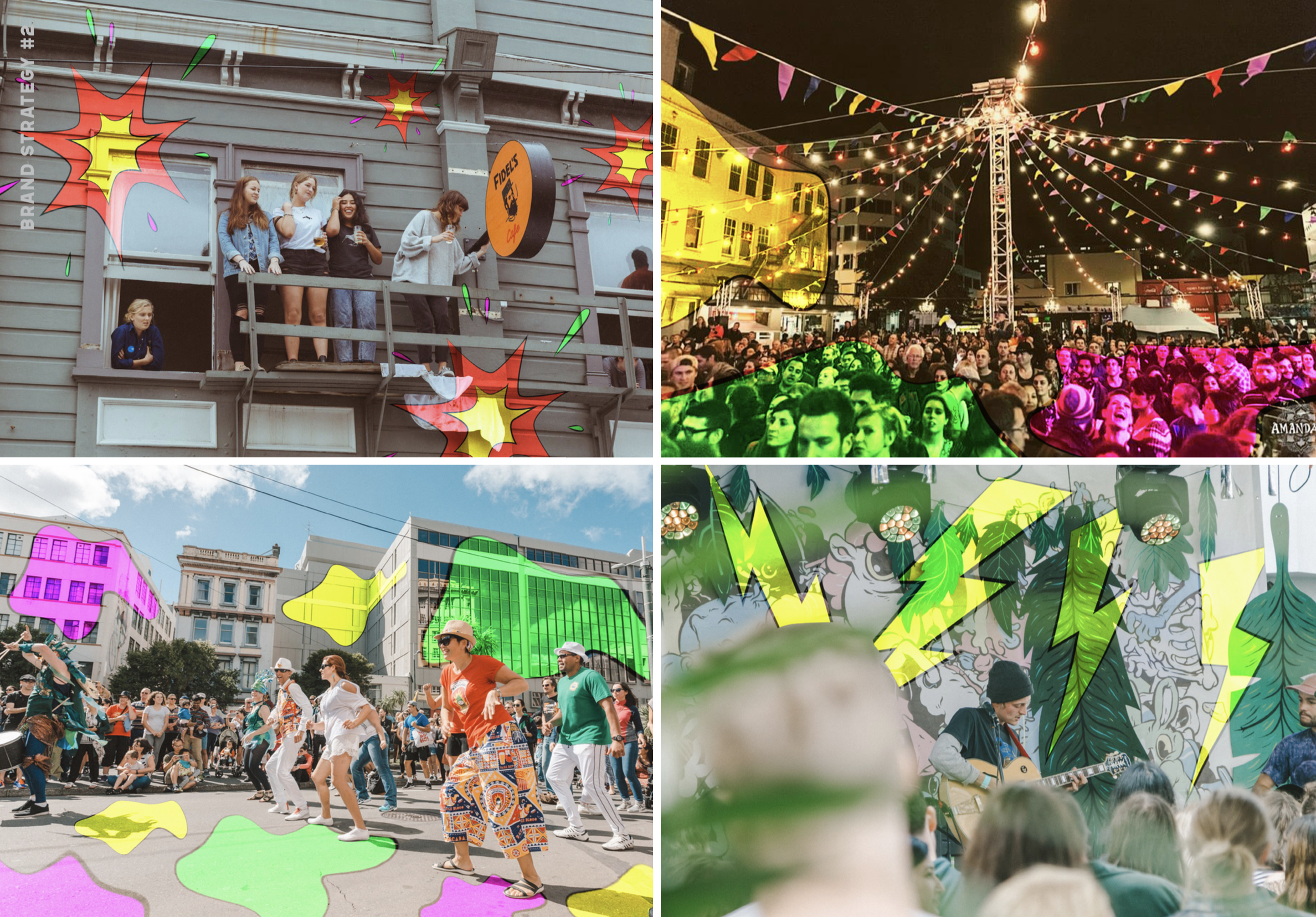
‘Celebration’, ‘eccentric’, ‘diverse’, and ‘astonishing’ encapsulate the spirit of the event. These ideas informed our overall strategy, leading to a succinct brand essence of… ‘Experience the Astonishing’.
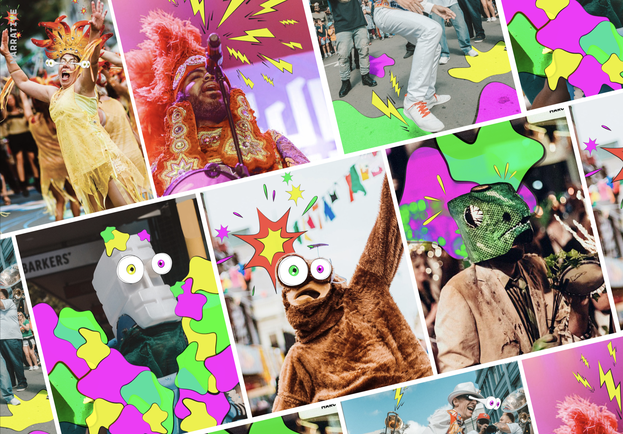
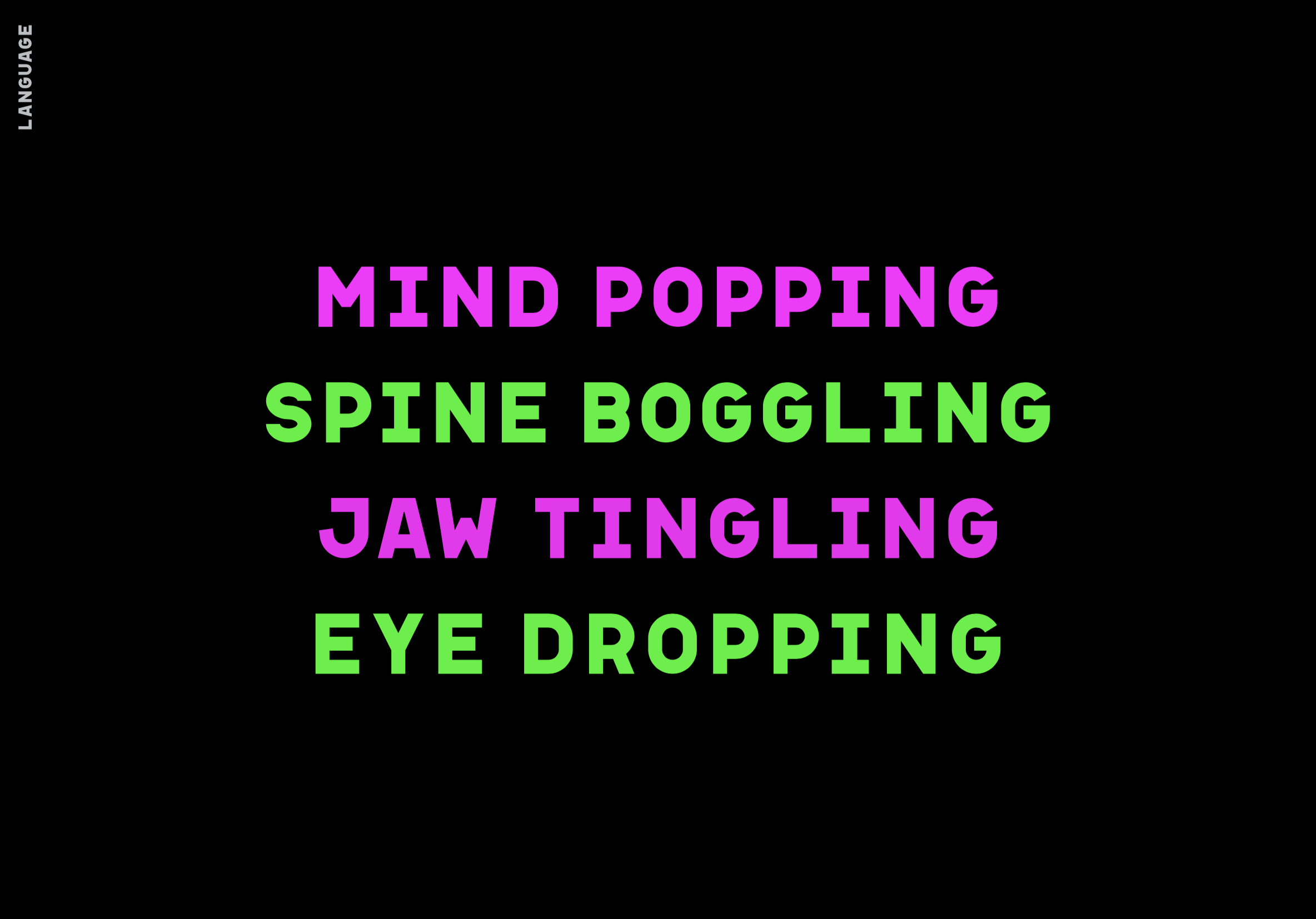
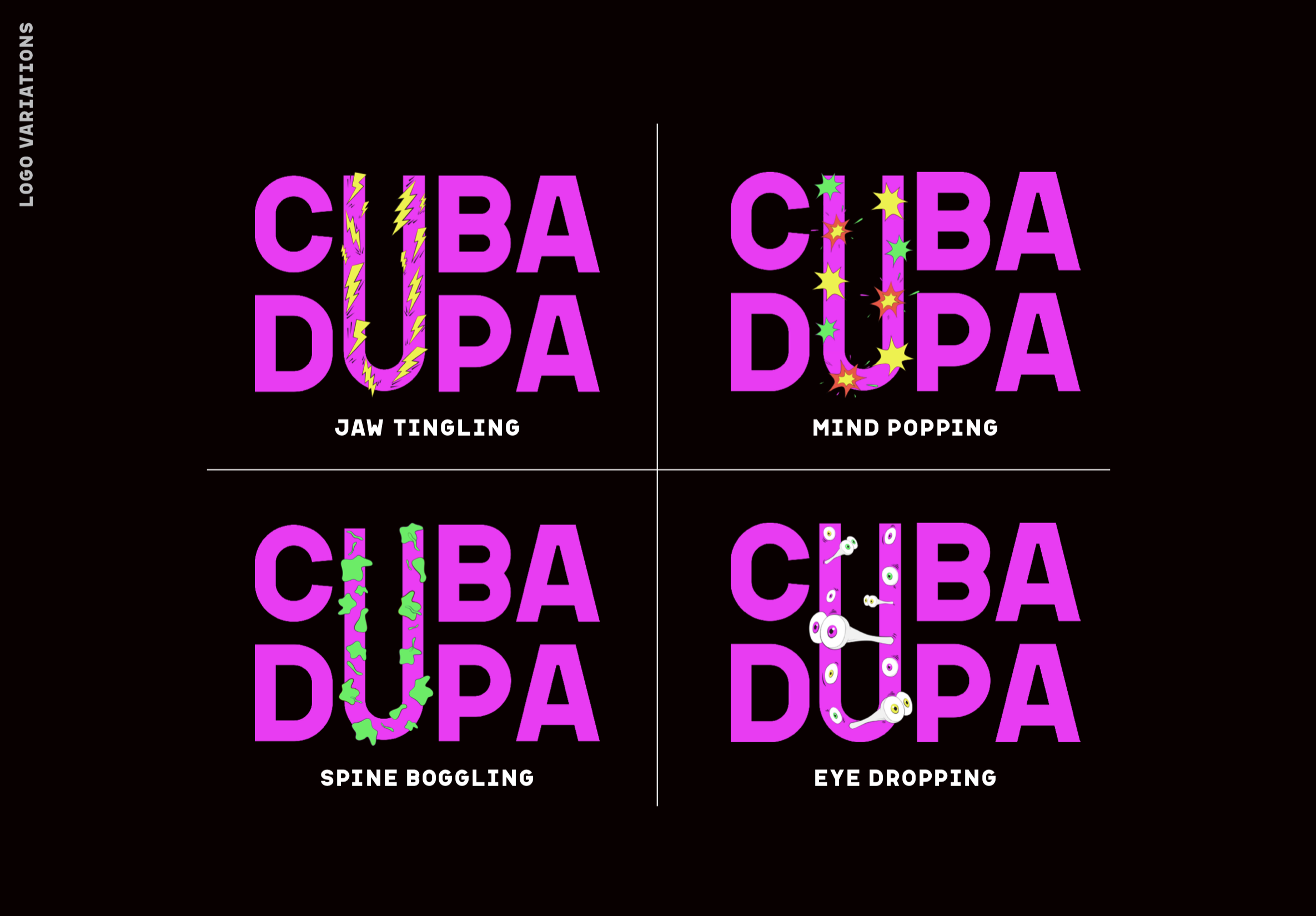
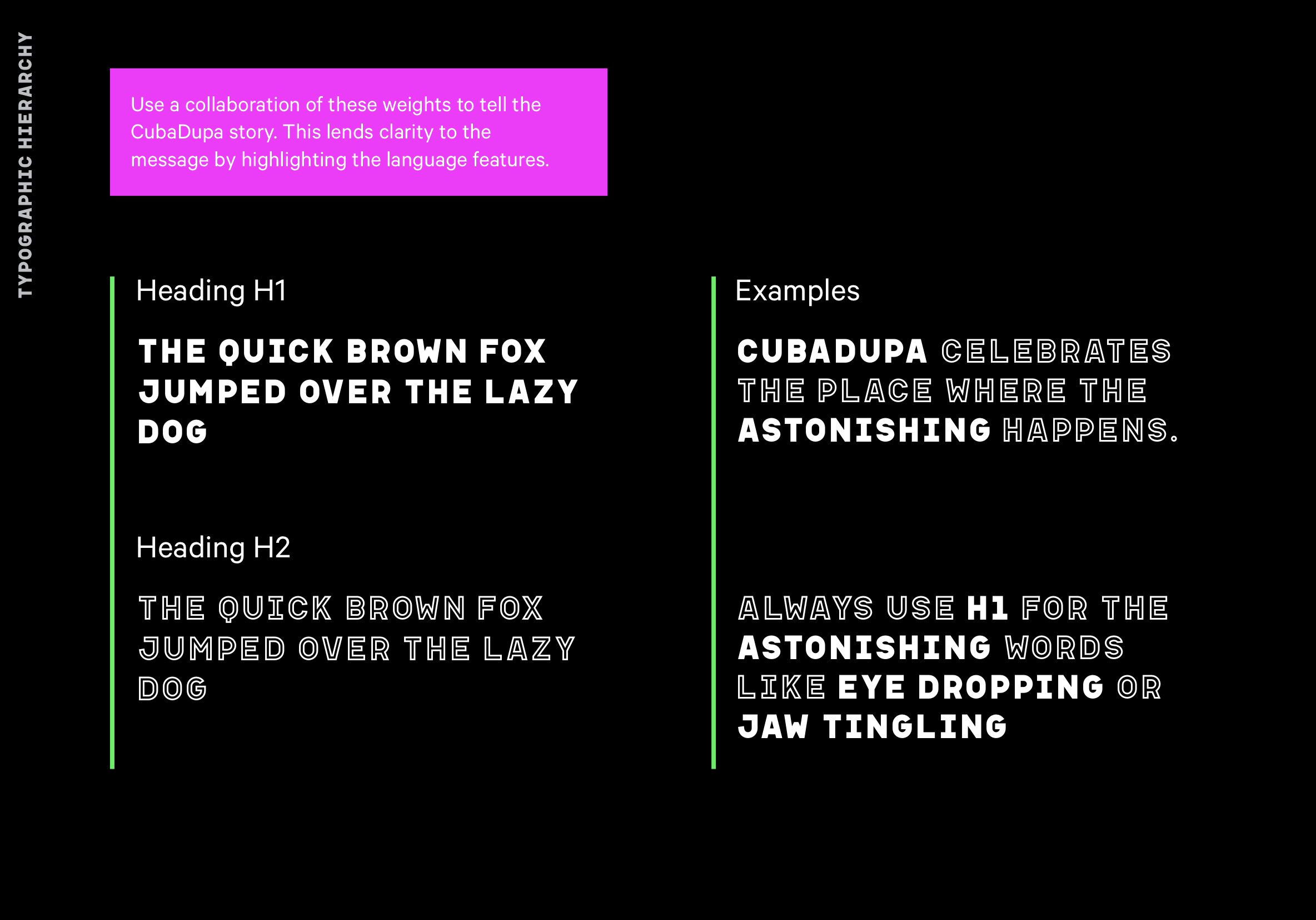
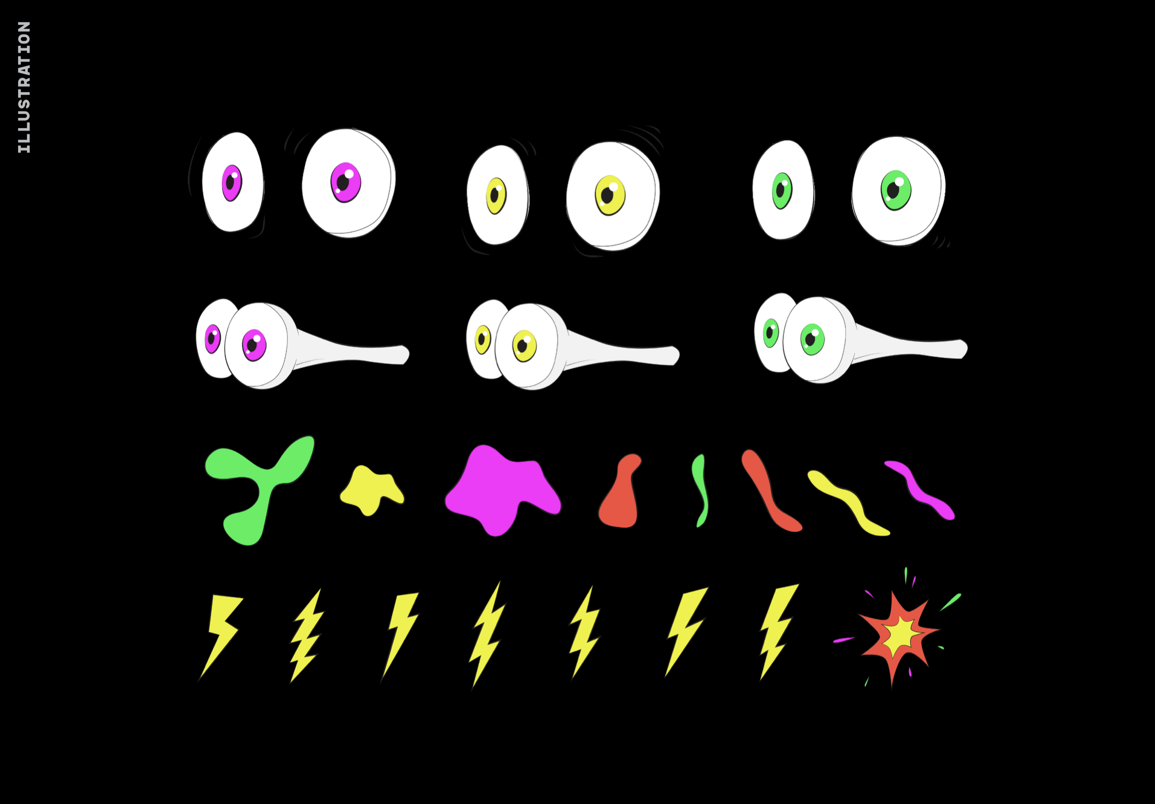
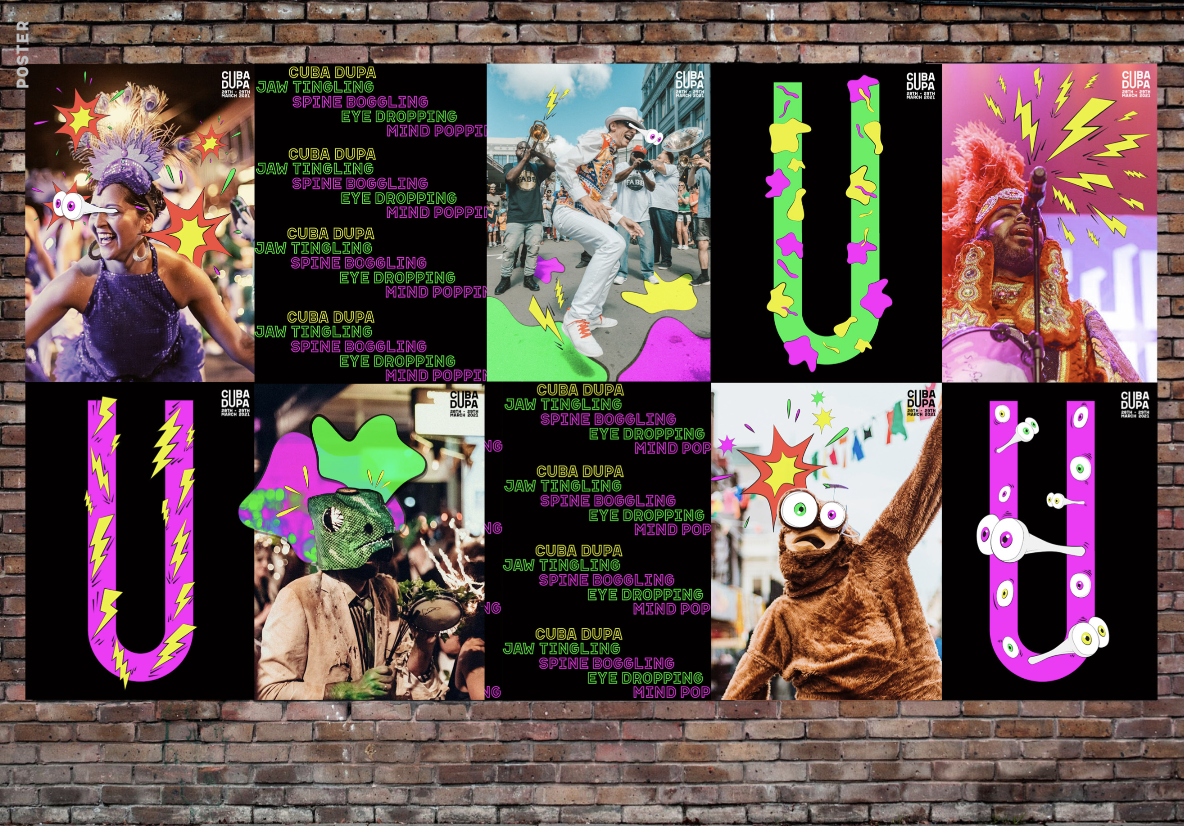
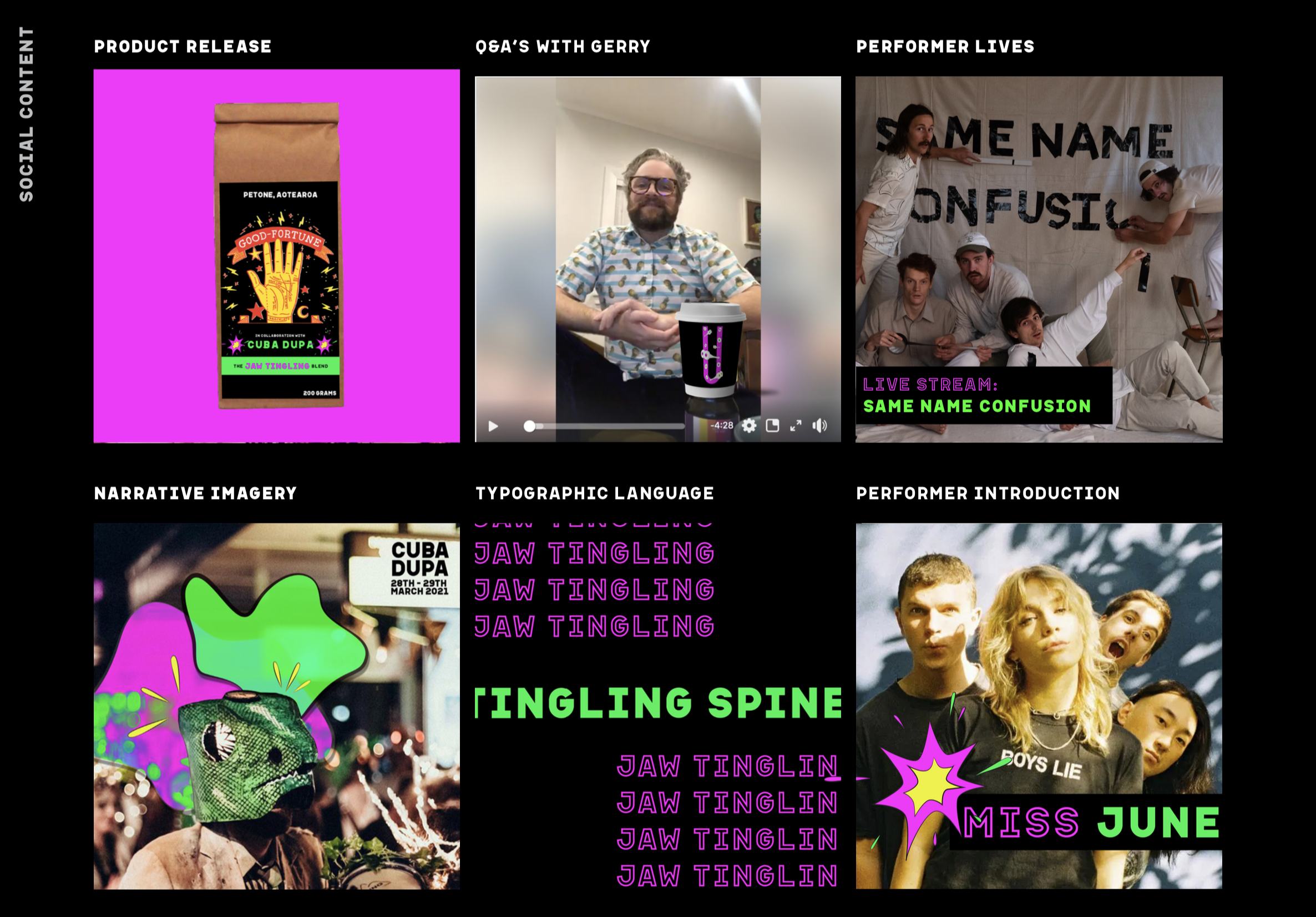
Language features like “mind-popping, spine-boggling, jaw-tingling and eye-dropping” were used to emphasize this brand essence, and reflect how CubaDupa makes an audience feel. Each illustration has a direct connection to one of the language features – highlighted by incorporating the illustrations into variations of the logo that allow each to speak without any extra copy.
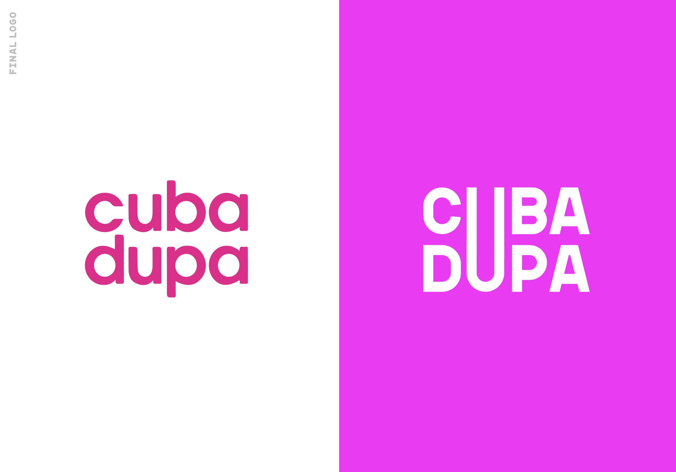
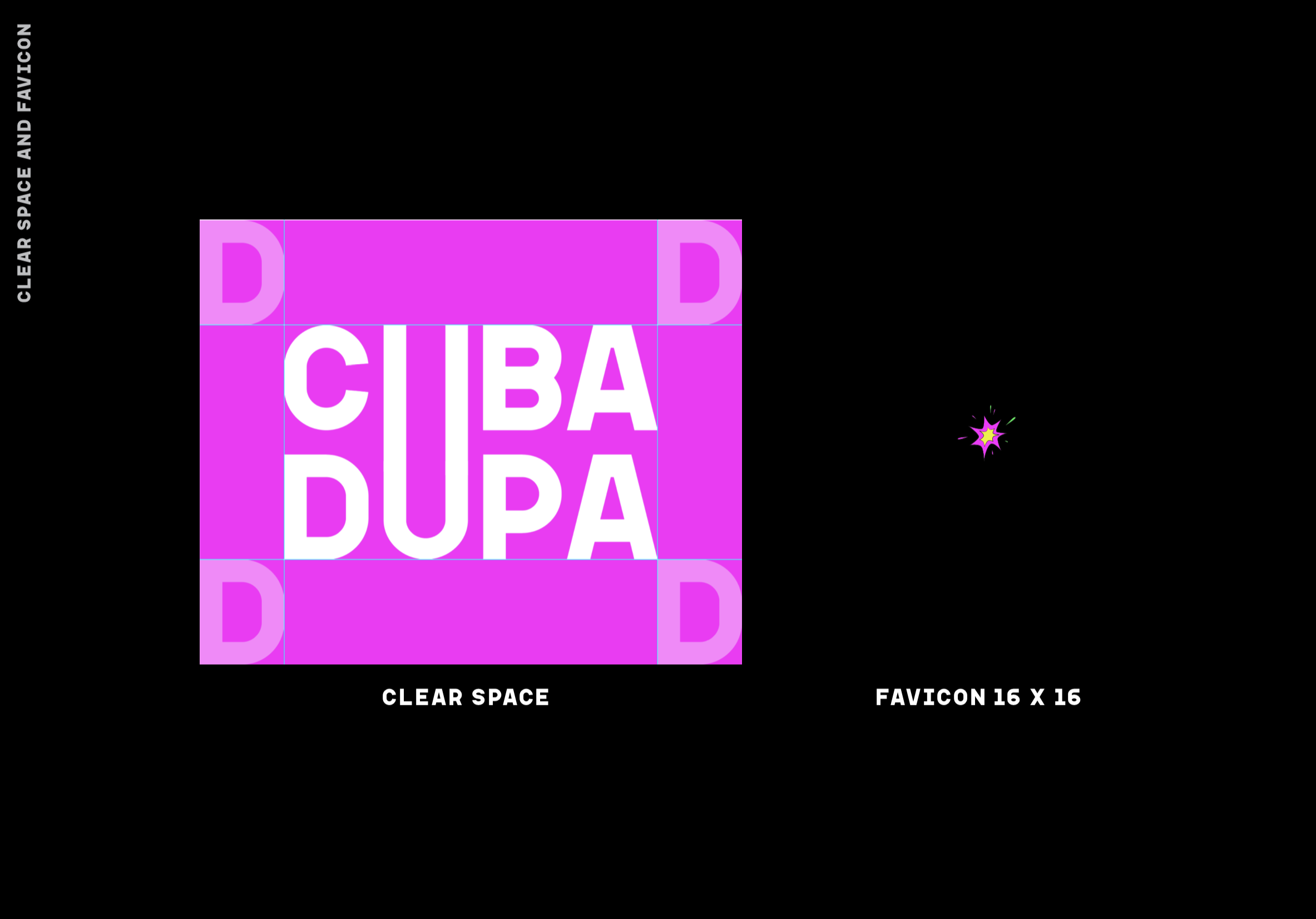
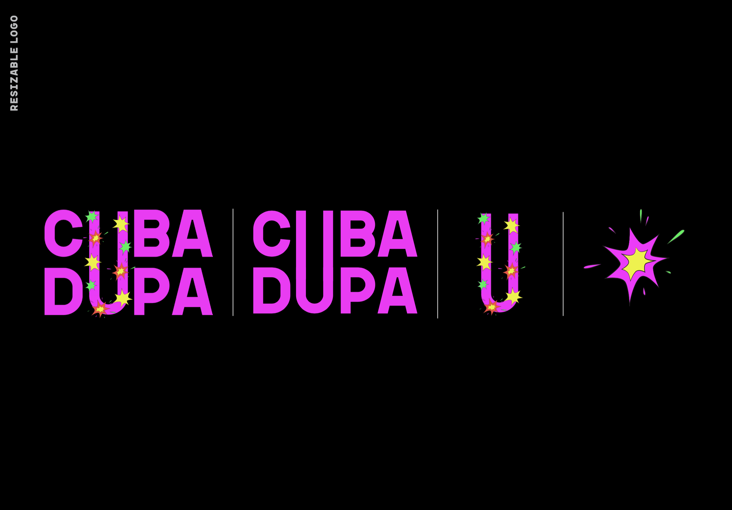
The logo is clear and easy to read. The singular ‘U’ creates interest and creates space to showcase the illustrative visual language.